Today, the digital landscape has significantly altered how we learn in school, particularly in history. Instead of only being able to read about the past, we can now interact with and access numerous archives directly from our screens. That’s where SlaveVoyages.org comes into play. SlaveVoyages.org is a great example of how technology and history can come together for accessibility and education.
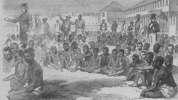
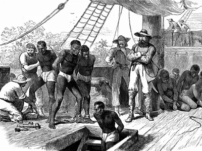
This website is an interactive project that explores the trans-Atlantic and intra-American slave trades. There are years of research, data, and visual storytelling throughout the website. Users can explore over 30,000 documented voyages and stories of millions of people who were forced to move across the world. This site is special because it transformed all of the history into something very meaningful.
What is SlaveVoyages.org?
SlaveVoyages is a research database and interactive map. With each individual voyage, users can see ship names, arrival and departure ports and dates, number of enslaved people, and sources, on an easy-to-use site for everyone to learn. There are also essays and charts to help users understand the patterns of the slave trades.
There are so many options users can explore. There are filters so users can filter by country, region, and even time period. The options provide much curiosity, with more and more information the further you explore them.
First Impressions and User Experience
When first opening SlaveVoyages.org, the layout is simple and organized. The background of the main page is a moving picture of an ocean, which does correlate with the voyages. The homepage has options of “Voyages,” “People,” “Timelapse,” and “Learn More.” In the top left of the main page, there are more options to explore, from “About” to “Downloads” and many more in between. This is straightforward even for first-time users. The interface is clear and consistent, which shows that the creators thought about usability and user experience.
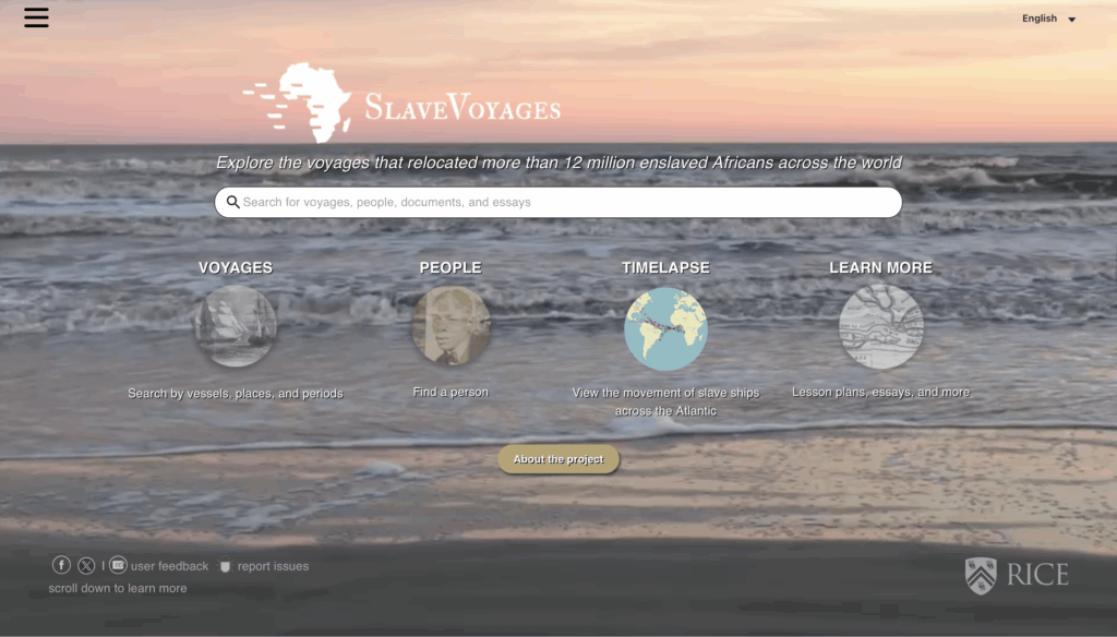
The most impressive part of this site is the maps. Users can watch voyage routes appear on the map and see where they depart from and where they arrive. If you hover over the map, you can see how many people disembarked from each voyage and where they came from. Traditional learning methods like textbooks cannot capture something like this and allow users to really comprehend the voyages.
When using the search option, it loads quickly and allows users to find what they want easily. For researchers or students, this accessibility makes the site very practical.
Accessibility and Design
One of the strongest aspects of the site is its accessibility. The website is free for everyone to use, and there are no logins or paywalls. This makes all of the information accessible to everyone, like students, educators, and the public around the world. The site includes easy-to-read and clean fonts, which makes the site visually appealing for readers. You don’t need to use a computer to access this site, but you may use your phone to access this site as well.
This website accommodates many different learning styles. People don’t always have the same learning styles, and this website does a good job at helping with this. For visual learners, there are maps and timelines to help, while analytical learners can use the numerical data and tables. There are different ways to learn and conceptualize the data being provided.
There is one part of the website that could be improved. That would be the accessibility for everyone, and that would be offering more audio and or video content for people who learn best through listening or who may have visual impairments. This would make the website much more inclusive for everyone and would make the website perfect.
Content and Educational Value
There is so much information provided by this website. There are records from centuries of trans-Atlantic and intra-American slave trading. Each entry represents real people, ships, and events that were part of one of history’s largest forced migrations.
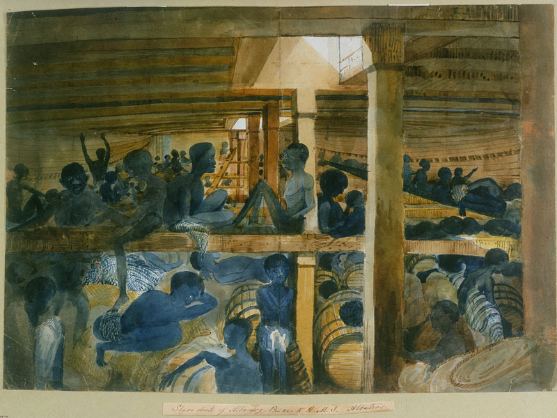
The site shows numbers, but it also humanizes them. What this means is that if you click into the “People” section, you can see the individuals’ stories constructed by historical records. This reminds users that those are real people with names and a story, instead of seeing just the statistics of them and being just a piece of data.
This site would be very useful in classroom settings. Teachers could use the interactive maps to show students the slave trades in real time and have the students use that data to do their own research or projects. This encourages active and engaging reading rather than passive reading, which has been shown as a huge benefit in education.
Technology and Medium
From a technology standpoint, SlaveVoyages.org succeeds in using digital tools to help understanding. The project uses interactive maps, data visualizations, and downloadable datasets to turn traditional historical information into an engaging experience. This evolves historical education into a new modern historical education, easier to learn and understand.
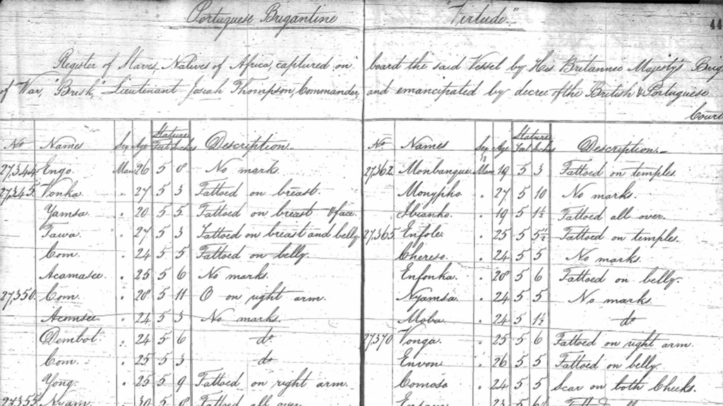
Some of the data pages can feel a little overwhelming at first, with the large tables and long lists of numbers. It would be beneficial if they had a guided experience or a tutorial for new users who may not be familiar with a database like this. For being as detailed as it is, especially with all of the information, it is surprisingly very user-friendly.
Purpose and Impact
The creators of SlaveVoyages.org wanted this project to be educational and enjoyable. It doesn’t just provide data, but it honors and tells the lives of the millions of people affected by the trans-Atlantic slave trade. They transformed historical data into a modern interactive design that stays relevant for future generations.
The website is reliable, and users can read all about the project and their credibility. There’s extensive information about the project’s history, the contributors, and methodology. This information builds the site’s credibility and shows users that the creators were committed to providing useful and historically correct information. This site is a great example for other creators who want to make their sites more open and understandable.
“This ever-evolving website is the collaborative effort of dozens of researchers working in libraries and archives around the world…” “This blog will offer perspectives on how information found in the databases can be used in a variety of settings and by teachers, students, researchers, and members of the public.” -Jane Hooper, Department of History
Strengths and Weaknesses
Strengths:
- Content- Website is vast and well-documented, offering reliable data for research and education
- Interactivity- The map allows learning to be “hands-on” and engaging
- Accessibility- The site is free and open to everyone allowing everyone to learn
Weaknesses:
- Limited Multimedia- If videos or audios were added it would enhance the emotional impact
- Overwhelming- Some parts of the site may be overwhelming for first-time users with the amount of information there.
- Enhancing Accessibility- As mentioned earlier, added features like videos and audio would help visually impaired users.
Even though there are some weaknesses, the overall project was very well executed. The creators did very well with this project and have an educational design that is hard to do.
Broader Implications
SlaveVoyages.org shows the power of digital media and how it reshapes our interactions with history. It shows how technology can preserve and tell stories that might be forgotten and make them available to everyone interested.
Conclusion
Overall, SlaveVoyages.org has successfully been able to show history, technology, and education. It’s clear, interactive, and accessible, making it a good example of how digital media can transform learning. This site doesn’t just straight-up provide information, but it engages, challenges, and connects users.
As someone interested in digital media, SlaveVoyages.org is a transparent, user-friendly, and easy-to-navigate site. It preserves history as well as bringing it to life. It allows users to see, explore, and feel the weight of the most significant time periods. It is a great reminder of how technology can be used to understand and educate all.
Visit SlaveVoyages.org to experience this digital history project for yourself! Slavevoyages. SlaveVoyages. (n.d.). https://www.slavevoyages.org/