
When you visit Disney.com, it’s not just a regular website; it feels like you are stepping into a digital version of Disney World. From movie previews to park information to shopping for merchandise, the site creates a fun experience for users to enjoy and stay engaged. Let’s see whether or not it follows Dieter Rams’ 10 Principles of Good Design.
Innovative Design
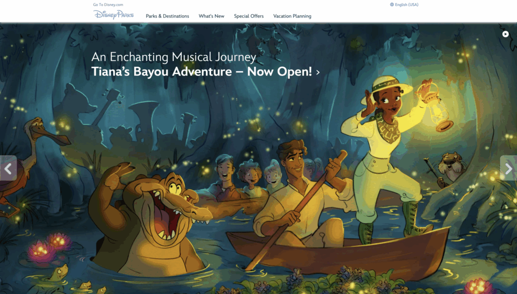
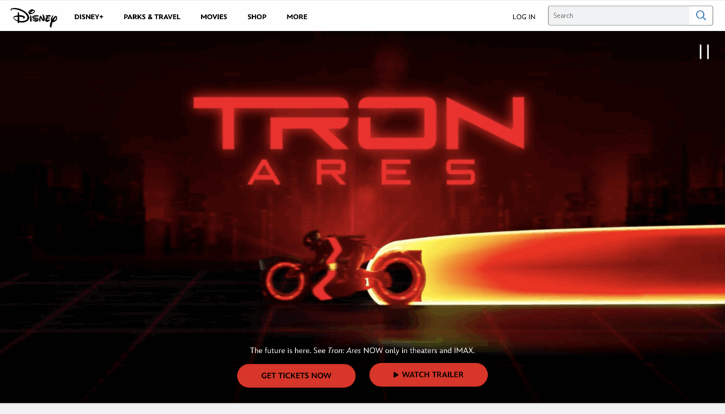
Disney’s site is full of visuals, animations, and interactive features. You can easily click through movie trailers, find where to buy tickets, and even explore upcoming releases. The sleek design perfectly replicates Disney’s creative brand.
Useful
The site is very functional and well-organized. Users are able to quickly access anything they need, from movies and TV shows, theme park information, merchandise, and shopping options. The search bar is easy to find for users, making it easy to jump straight to what you are looking for without having to scroll or click around too much.
Aesthetic Appeal
Disney.com’s design captures the brand’s personality very well. The site uses high-quality photos, different fonts, and bright colors that reflect the Disney branding of wonder and magic. Every page you visit feels polished and is visually appealing, which helps create consistency and an enjoyable atmosphere.
Navigation
The menus and sections are easy to follow and read. The top menu clearly organizes content into:
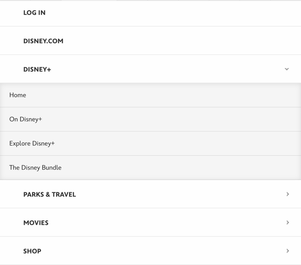
Navigation on the site is simple and intuitive. The top menu organizes everything into categories, as shown above. When you click on the menu option, more detailed subcategories appear, which make it easier to find what you are looking for.
Design
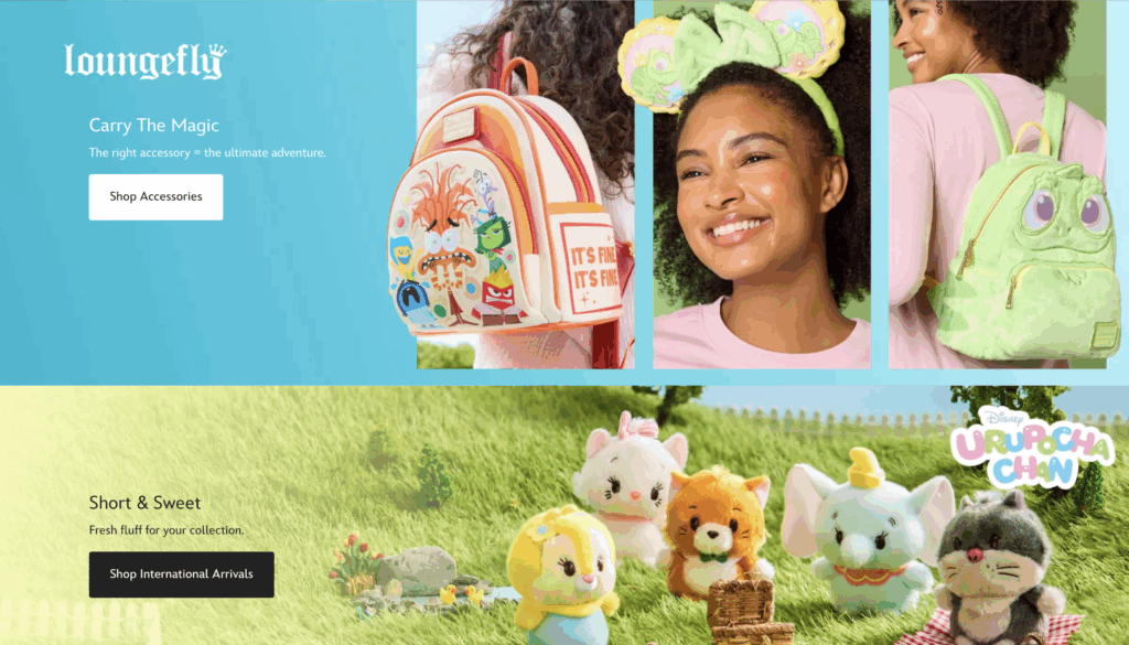
Animations and visuals make the experience pleasing for users without being overwhelming. It is a little overwhelming with how many different options there are to choose from, but then again, they are a very large corporation. Within the merchandise store, a lot is going on with the moving photos and banners, and lots of different options.
Honest Content
Everything on Disney.com is accurate and clear to the user. There is updated information, movie trailers, show descriptions, and park information that are all labeled correctly. This content is reliable and up to date, which builds trust with users and makes them more likely to return to the site at a different time.
Long-Lasting Design
The whole website is modern but timeless. Obviously, the content and media will update whenever new movies and shows are released. The website doesn’t necessarily follow any trends and has nothing that could feel “outdated.”
Attention to Detail
Every section feels very thought-out and fully designed, which improves the overall user experience. The fonts are readable, and the interactive features are smooth and respond quickly. Users can feel the effort Disney put into every page to ensure it works properly. Small details like these make the user experience much more enjoyable.
Digital Sustainability
This website loads relatively quickly, even though each page is packed with photos and videos, allowing for smooth experiences. This shows the company’s commitment to delivering a seamless experience for users on desktop and mobile devices.
Minimal Design
Even though Disney is known for its colorful and playful design, the website avoids too much of that clutter. Some sections may look a little busy due to the different content, but the layout is still clear, and users know where to go and what to do.
Overall User Experience
Overall, Disney.com is a great example of a website that’s engaging and easy to use. The design doesn’t make you think too hard and is easy to navigate. You can easily tell where to click and how to navigate through the site. Disney balances its family-friendly personality with usability, which overall creates a strong user experience.
Conclusion
After using Dieter Rams’ 10 Principles of Good Design, we can see that Disney.com does a great job at creating an enjoyable experience for its users. The combination of visuals, structure, and interactivity all reflect Disney as a brand, but it is still simple and easy to use. Disney is a good example of a good design that’s creative and user-friendly.