Review by Jenna Keyes
Visit the site here: oddcommon.com
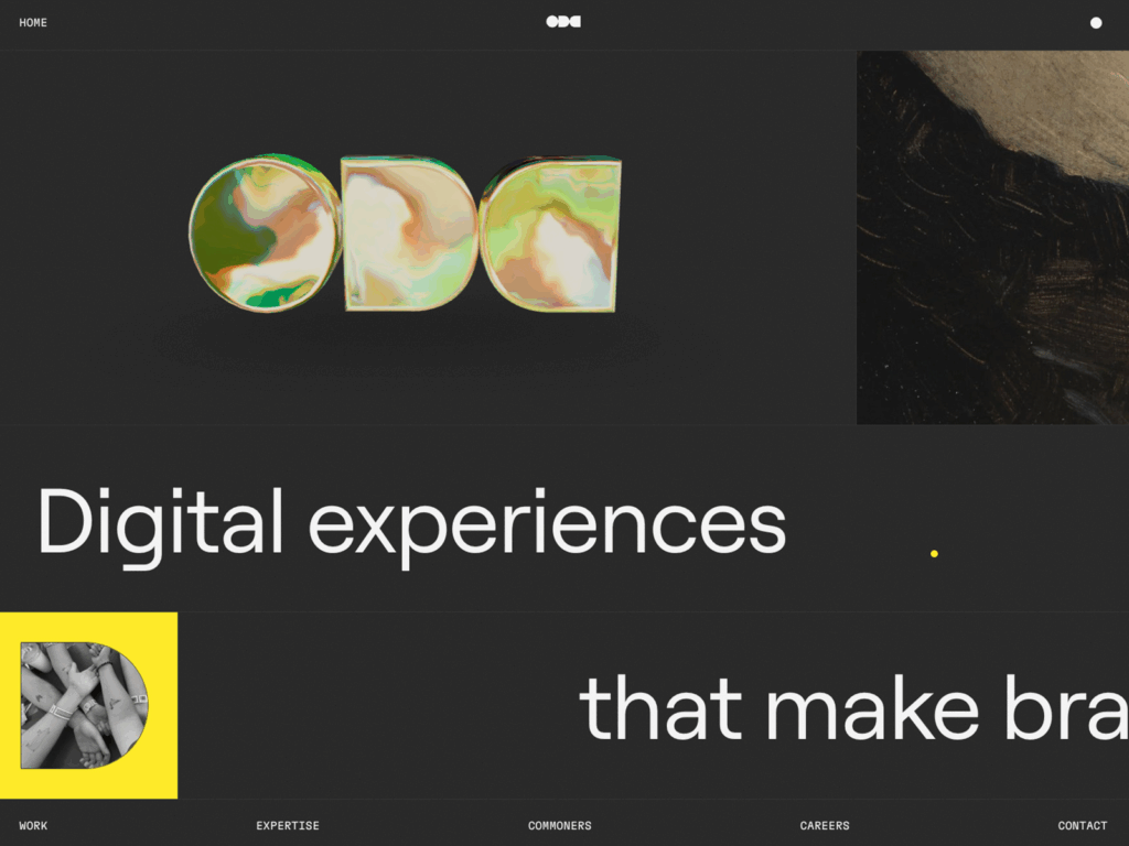
When you first visit oddcommon.com, it’s immediately clear that this isn’t your average design website. The homepage greets the users with bold, minimalist typography and the line “Digital experiences that make brands stand out.” That statement not only summarizes OddCommon’s purpose but also shows its approach to digital design. The site is alive with every scroll you take.
When I first visited the site, I immediately knew why it won a 2025 Webby Award. It’s a whole experience for users that feels personal, confident, and crafted to perfection. The very first scroll, it’s clear that this site isn’t trying to blend in by any means. OddCommon sets out to do exactly what their name suggests: make being “odd” feel like the most natural thing ever.
This review explores OddCommon’s website, how it’s built, who it’s for, and why it stands out. I will also take a look at its usability, accessibility, and how everyone can learn from it.
Why OddCommon is Interesting
Something interesting about this site that I have never seen before is that the whole site changes depending on whether you are in full-screen mode or have it taking up half your screen. In the video above, I had the site taking up my full screen; below is a screen capture video of what it looks like taking up half my screen.
I have never seen a site do such a thing, and I am super impressed with it. This shows that the site has really been thought out in every way possible; they did not skip a thing! The information on this page is all the same whether you are in full-screen mode or in half-screen mode, which ensures the users that you are not missing any information.
After noting that, the rest of this review will be written as the site is full-screen.
What the Site Consists Of
OddCommon’s site functions as a digital portfolio, a brand statement, and a contact place all in one. The navigation menu keeps it very simple for users. On the front page, everything the user needs to have to navigate this site is at the bottom. From left to right: “Work,” “Expertise,” “Commoners,” “Careers,” and “Contact.” Each of these sections expands into a deeper story about who OddCommon is and what they do.

The Work section highlights case studies like The Vincent Van Gogh Experience, Agencie Rebrand + Website, LMI Rebrand, and more. Each of these project pages is cleanly structured, and they include visuals, texts, and short summaries that show what OddCommon provides.
Under Expertise, OddCommon breaks down its site for users to read. They break it down into 3 principles: “Just Enough Strategy,” “Allergic to the grand reveal,” and “Go big on craft.” All 3 of these explain their site, how to stand out to users, and focus on the experience of the site.
The Commoners page allows users to see who is behind this whole site. They don’t hide any of the team and allow them to be front and center from the producers, creative directors, head of design, and everyone else who helped make this site as cool as it is.
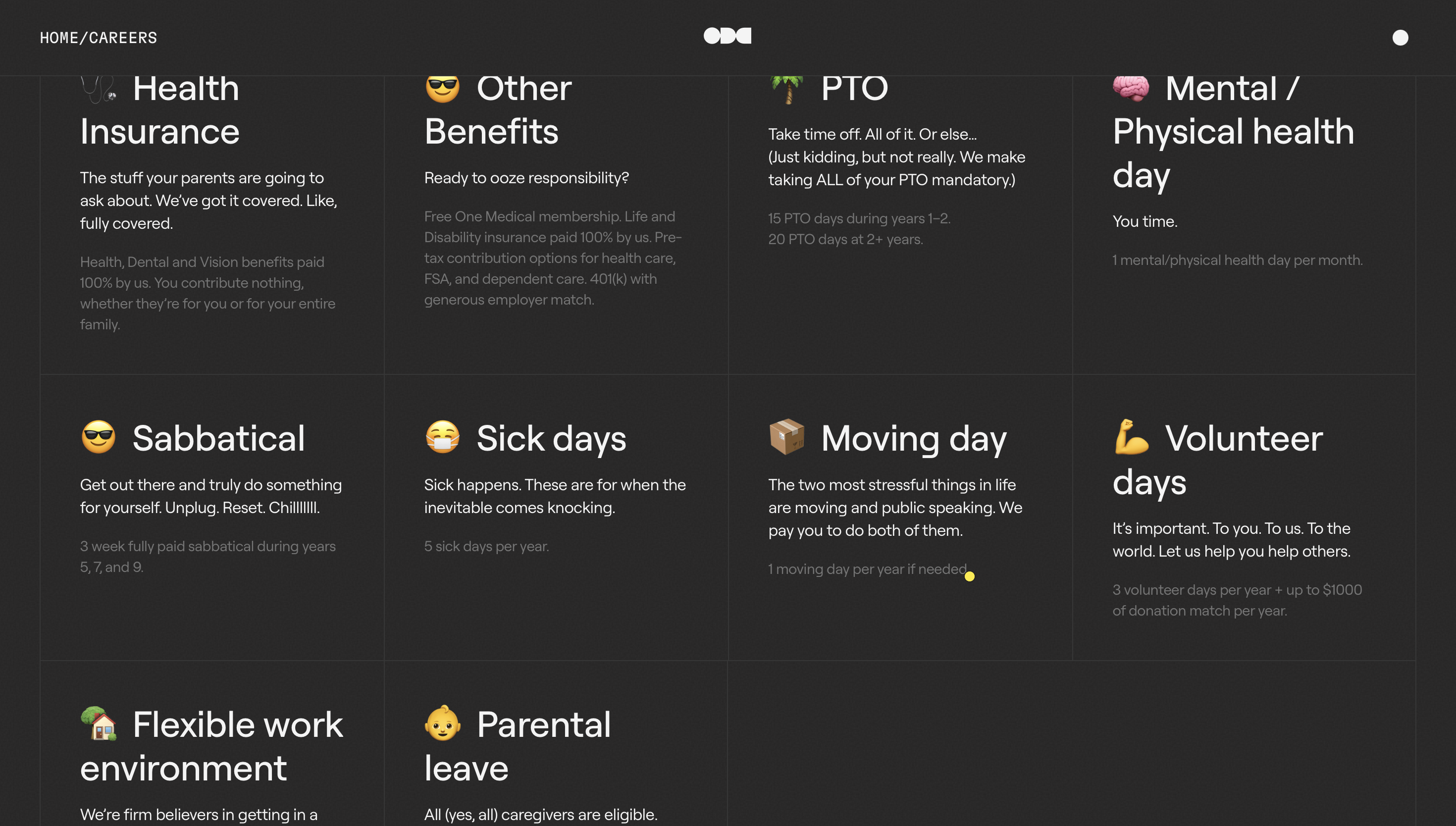
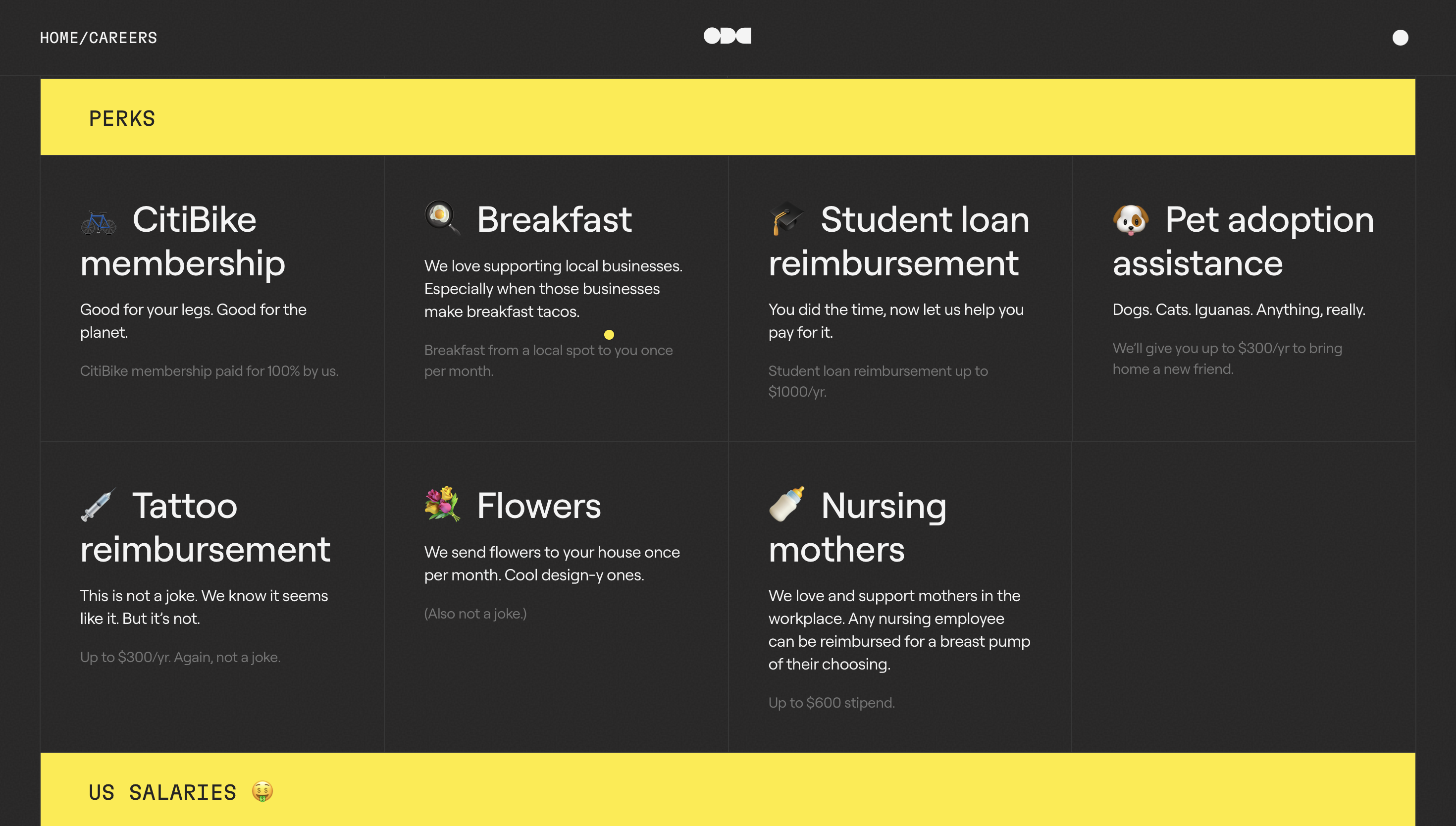
The Careers page is extremely transparent and honestly interesting to see since not a lot of websites do this. It breaks down each job and how much they would receive as a yearly salary. It shows all of the benefits from working here, from health insurance to 16 weeks of parental leave. Honestly, if I start looking for a job soon, I might just have to apply here! The benefits and perks are amazing!!
Under the contact page, users see two different emails. One is for New Projects, and the other one is for Media. They also include their two offices and their specific addresses; they have one in New York City and another one in London, England.
Accessibility
As for accessibility, OddCommon does very well in many ways, but it still could improve some parts of it.
What works well:
- Navigation is simple and consistent, allowing users to quickly find what they need.
- The site loads efficiently and responds quickly and smoothly to scrolling and clicks.
- Good contrast between texts and background, allowing it to be legible for users.
What doesn’t work so well and could be improved:
- Some of the animations with text overlays may create a challenge for users with visual impairments.
- Usually, websites have “reduce motion” or “accessibility settings” toggle; however, this website does not have that. For users who may be sensitive to motion or animation, the website could be extremely overwhelming with the transitions and effects
- There isn’t a search bar, which does make it more difficult to navigate. However, the site is very well organized, so it doesn’t necessarily need a search bar.
Overall, OddCommon’s website feels inclusive and is overall readable and direct for most users
Clear Message and Target Audience
OddCommon’s message is straightforward. They build creative digital experiences that help brands stick out. They don’t just straight tell you how to do it; they show you through every design on the site.
Their target audience is for businesses, agencies, and organizations that are looking for a high-quality design as well as to make their message known.
Their message works because they communicate it visually and verbally. All the headlines, photos, and animations contribute to the idea that OddCommon has built function and beauty within its site. They don’t use typical marketing jargon, but they let their portfolio do the talking.
This site is confident and approachable, which is kind of a rare balance in the digital world. OddCommon feels clear and humanized, but if other sites balance those two, it can feel cluttered.
Inspiration for My Own Site Design
Exploring the site made me think about my online design and storytelling. It’s a reminder that websites don’t have to just throw information at users, but you can create experiences for them
This site shows how simplicity can be powerful. The site doesn’t throw all these colors and fonts and pictures at you; it has a limited color selection, it uses minimal text with easy-to-read fonts, and everything is very well thought out.
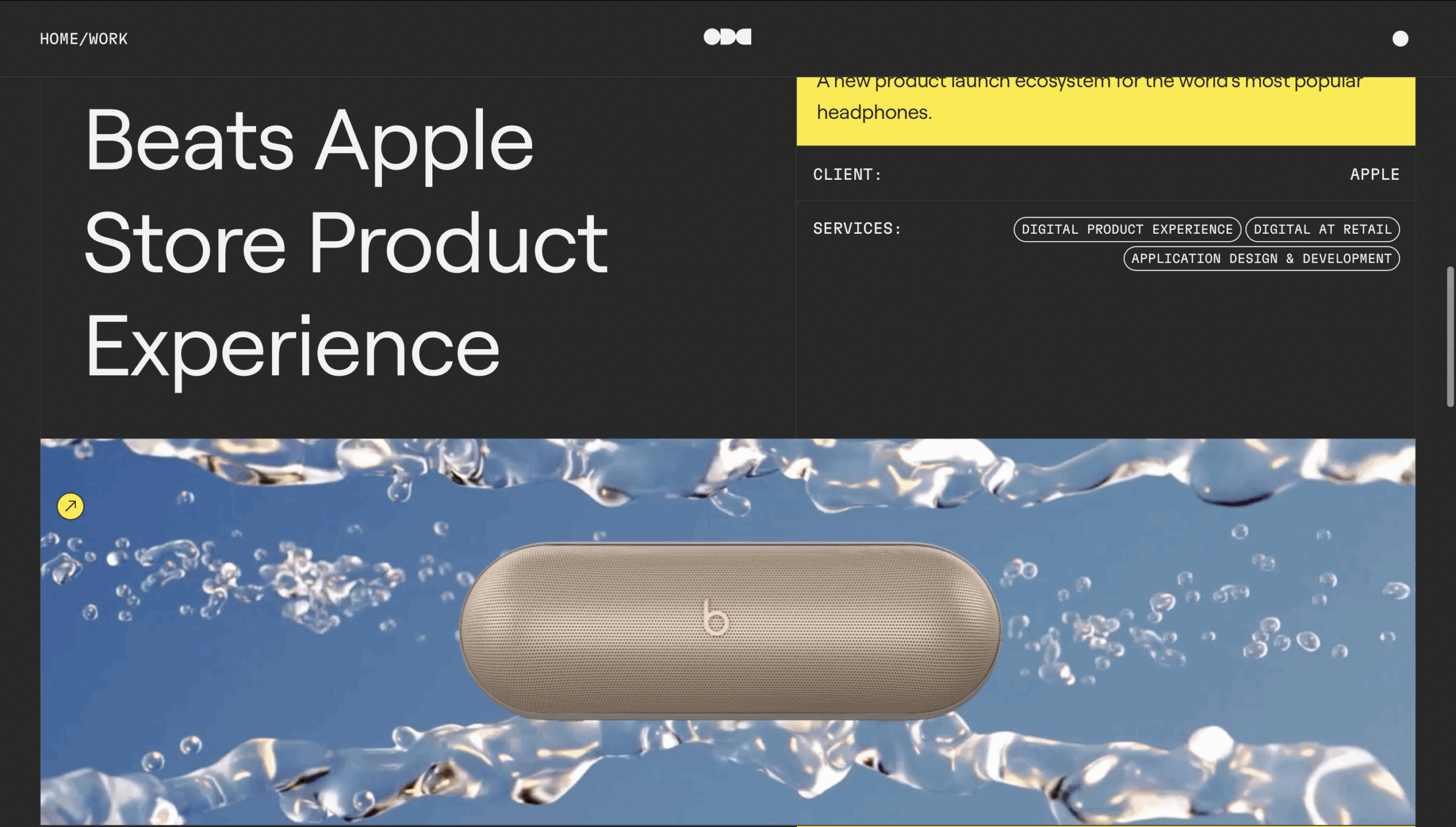
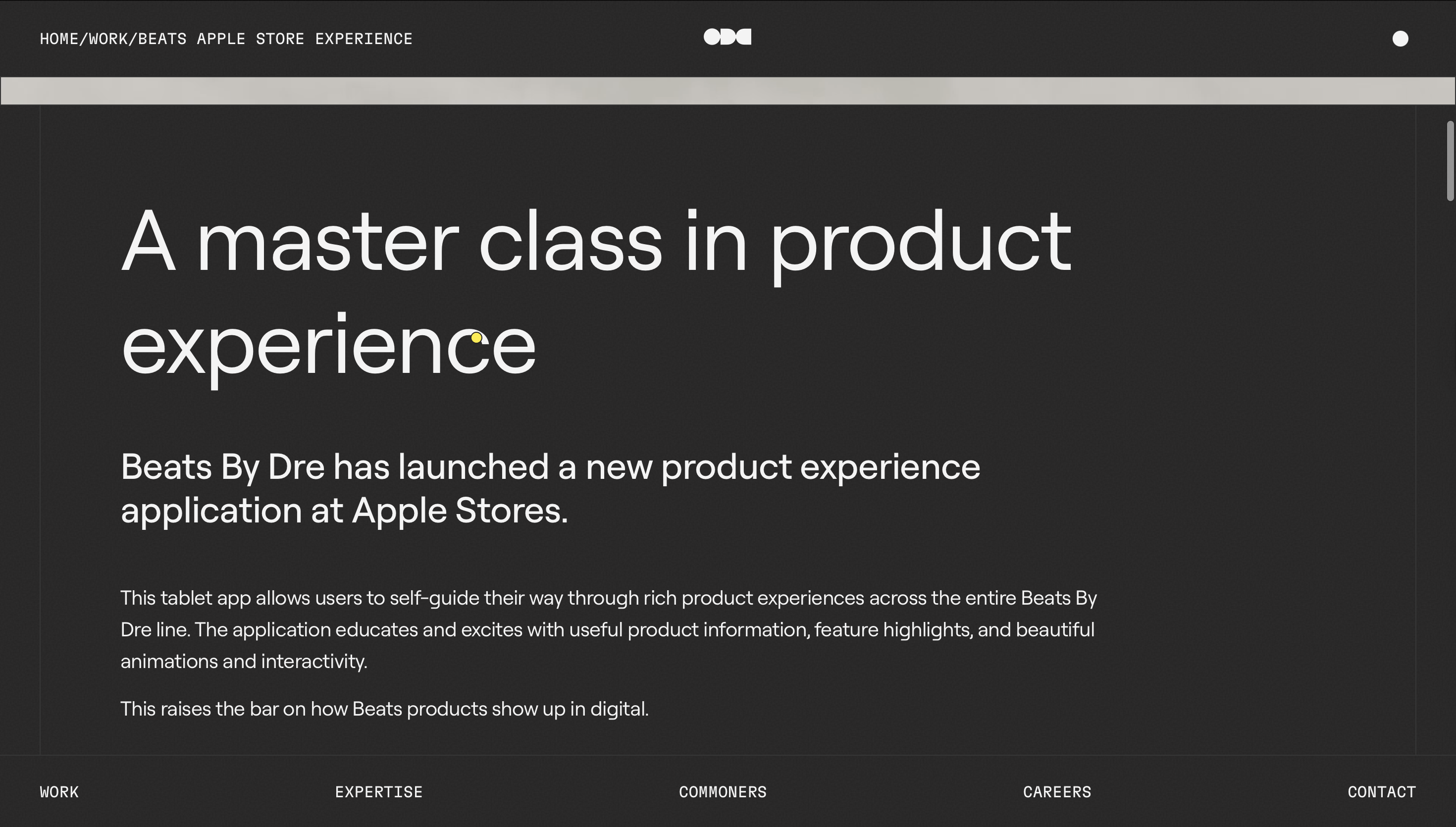
The information provided is very simple and easy to read but gets the point across without overwhelming the reader
They do a great job of showing rather than telling. They don’t brag about how innovative and interesting their site is; they just show us with their visuals and storytelling on each page you visit
I love love love how they actually credit and show who their team is. This gives each and every person involved credit where credit is due. It shows users that there are people who created such a thorough website with everything thought out. It is something that I believe all websites should have!
Design and Content Creation Elements
OddCommon uses almost every element of effective modern design we have talked about so far.
- Responsive Design: The site works seamlessly across all different devices. All texts, layouts, and visuals look the same, no matter if you are on the website on a phone or a laptop, and allow for a high-quality experience.
- User Experience: Navigation is easy and seamless. When you scroll, it’s smooth and quick, and everything just works well.
- Universal Design: Some motion may cause challenges for some users, but the clear structure and visuals help with accessibility for other users.
- Information: This site allows users to never really feel “lost.” There isn’t too much information that makes users feel overwhelmed and feel like they don’t know what to do next. However, there is just the right amount of information for users to understand the site and its message
- Storytelling: With each project page, there are visuals, texts, and outcomes that show the impact without overwhelming readers.
They do a phenomenal job of using and showing creativity, but also usability. They use design to enhance storytelling.
Final Thoughts
OddCommon’s website is a wonderful example of creative minimalism and digital storytelling. With all of its animations and effects, it’s also purposeful, usable, and memorable.
For web designers, it’s a good reminder that motion and simplicity can go together when done correctly. For the general audience, it’s a good example that websites can be functional but also very engaging.
Overall, OddCommon’s site stands out because it curated a highly functioning digital experience for all users to enjoy.
If you haven’t looked at the website, you definitely should. It’s a really interesting site and fun to go through.
Visit here: oddcommon.com